A User Experience Designer and Web Developer
Finding the Perfect Parking Spot should be as simple as booking an Airbnb


The Team
Muskaan Dhadwal
Kylie Ho
Andrew Wilson (Startup's Software Developer +
Product Manager)
UX Methods Applied
-
Design Thinking
-
Interviews
-
Card Sorting and Surveying
-
Wireframing
-
Prototyping
Project Category
UI/UX
My Role
UX Researcher and Designer
Project Duration
3 months
Jun - Aug
Tools Used
-
Miro
-
Figma
Problem Statement
Our client's objective was to have us craft a comprehensive buyer experience tailored to their startup. Simultaneously, they sought a revamp of their existing screens, aimed at enhancing their intuitiveness and user-friendliness. A primary requirement posed by the client was the identification of frequently employed search filters by users when in search of a parking spot. Our task extended to strategizing the optimal presentation of these amenities on their webpage. This strategic approach not only aimed to provide a competitive advantage over rivals but also aimed to facilitate precise user-to-parking spot matches, aligning with each user's distinct preferences.

Summary
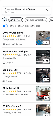
Before: One column grid ---> After: 2 column map view
Before: Unable to book parking spot on gameday ---> After: Event spot booking based on the dates listed
Before: Unable to view individual listing ---> After: thorough detail page of every listing with ability to save and refer back
Before: Unable to filter listings according to preferences ---> After: Filter listings displayed according to needs and preferences
Our Design Process

EMPATHIZE

DEFINE

IDEATE

DESIGN
Exploring User Parking Preferences: Unveiling Insights and Priorities


Step 2: Crafting a User-Centric Survey
Having compiled the attributes, our next move was to engage a broader audience to gain valuable insights. To accomplish this, we crafted a comprehensive Google Form survey. This survey was strategically designed to resonate with various user groups, maximizing its reach and impact. Participants were invited to assess each attribute on a sliding scale, gauging their personal preference, ranging from 'extremely important to me' to 'I'm indifferent about this.' This interactive approach facilitated a dynamic and authentic depiction of user priorities
Step 1: Unveiling Essential Attributes
To unravel the intricacies of users' parking spot preferences, we initiated our research by meticulously identifying 20 key attributes and conveniences pivotal to the parking experience. These attributes were carefully curated as potential search filters, aimed at providing users with tailored results. The significance of this stage was paramount, as the attributes' rankings would serve as the blueprint for the entire project's trajectory. Each filter played a pivotal role in allocating focused development time, ensuring a streamlined and purpose-driven outcome.
Step 3: Aggregating User Wisdom
As responses flowed in, we meticulously consolidated the rankings, effectively harnessing the wisdom of 30 diligent parking seekers. The power of collective insights was harnessed to paint a comprehensive picture of user preferences and priorities. Every rating choice on the survey was assigned a specific point value, ensuring that the data was both quantitative and qualitatively informative. For example, 'Extremely Important' translated to 4 points, 'Important' to 3 points, and so forth. The cumulative points derived from the participants' responses collectively shaped the trajectory of the design process.
Diving Deeper - Conducting and Analyzing Interviews
Answering - “Who are we designing for?”
We interviewed people. Then we grouped interesting things they said to find overlaps, similarities, and important insights.
_edited.jpg)
We found there are 3 major factors that affect people’s selection of a parking spot: Price, Proximity, and Security.
While price and proximity are both top priorities, they often feel like trade-offs to people. People who prioritize cheap prices are willing to sacrifice on proximity and get a further spot from their destination, where as people who prioritize proximity are willing to pay premium to park close.
Evidences
Price vs. Proximity

Security means different things to different people
_edited.jpg)
Personas

Providing the hotel booking experience for a parking spot .
The aim of redesigning the buyer dashboard was to provide users with a similar level of intuitiveness and experience to that of booking hotel rooms. Initially, our designs drew heavy inspiration from the Airbnb experience. However, based on user testing of our initial sketches, we soon realized that a blend of the Google Maps experience with the former would be more fitting for the targeted audience.
IDEATION AND SOLUTION PROPOSAL
Brainstorming to Low-Fidelity


Unified, Lucid, and Cost-effective Design
The designs have been created to enhance the users' existing mental models and introduce intuitiveness to their workflow. Furthermore, the grouping adheres to the semantic roles of information hierarchy, making it easier to identify correlations between elements on the screen.

Since we collaborated with a developer to construct this end-to-end case for the users, it was crucial for us to envision the edge/error cases that users might face while interacting with the interface. This not only conforms to the heuristic evaluation guidelines outlined by Nielson Norman but also aids in expediting development by eliminating the need for ad-hoc error handling.
Errors for the win !!
Unwrapping the Process
In order to achieve a more streamlined workflow and enhance our prototyping capabilities, we separated our asset files from our design folder. This enables us to easily reference and reuse any component we require. Additionally, this approach greatly facilitated the development of the fundamental elements, or 'Atoms', within our design guide.


To maintain uniformity and consistency across all our screens, we began by creating a style guide and establishing grid rules. Whether it involved designing cards on the screen or determining the spacing between icons and other elements, we referred to the guide we had developed. Many of the size constants were drawn from Google's Material Design, which we sought to incorporate into our design system.
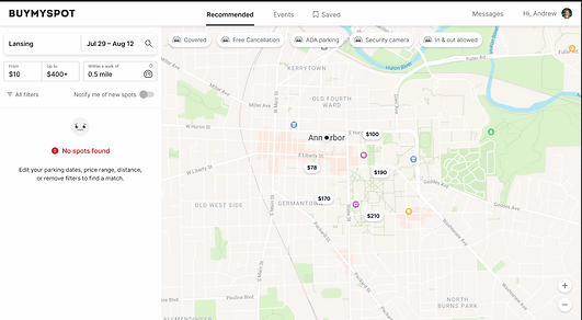
To illustrate the adaptability and responsiveness of our design, we created screens for both desktop and mobile views. This allowed our developer to visualize how the screens would transition between the two interfaces. This was particularly crucial as we aimed for a seamless experience in our prototype, transitioning, for example, from a centrally positioned filter screen on desktop to a hamburger menu on mobile.
Desktop and Mobile Prototype


Established a flow to help the developer comprehend the transitions between screens.
Following the flow above, Play around with the Desktop Prototype below
Responsive Design for Mobile Screen

Designing Flows within Flows - The Cancellation and Refund Saga


Effortless Event Parking Solutions
Sleek Profile Page: All You Need in One Page
